Image Brightness Analysis
August 18, 2009 § 6 Comments

Block brightness analysis of the stoma photo below.
This summer I read Michael Freeman’s excellent book “Perfect Exposure” on the basic, yet complex issue of exposure in photography. In the book Freeman uses a neat technique to analyze the brightness distribution of his photos. I’ve tried analyzing some of my own photos the same way here.Most photographers are used to analyzing the brightness distribution of their photos with the image histogram. It shows all that is needed to say something about the contrast of the photo, if it’s high or low key, clipped in the highlights or the blacks etc. But it doesn’t say anything about the brightness distribution within the frame. You can of course see this in the image itself, but it’s easy to get distracted by image content and colors. Freeman’s method is to desaturate the image and break it down to larger squares.

Stoma photo with image histogram. (ISO 200, 1/60, f/5.6, +1 EV). Photo by Øystein Horgmo © http://www.oncolex.no
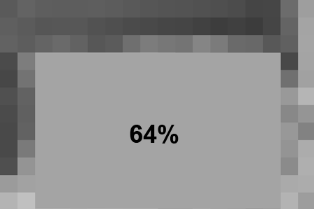
This photo of a stoma was exposed for the patient’s skin with a +1 exposure compensation. Applying the filter “Average Blur” to the skin area of the block image and reading it, reveals (not surprisingly) an average brightness of 64%, or approximately 1 stop above average brightness (50%). A suitable exposure for caucasian skin. The overall average brightness of the photo is 55%.

Average brightness of the skin area.
The rest of the scene contains no highlights or deep shadows, so there was no problem fitting it to the cameras dynamic range.
What’s the point of this exercise when the photo is already taken? It’s always useful to be conscious about exposure choices. Analyzing photos can help you recognize the same exposure challenge the next time it pops up and make the right choice. Being able to break down a scene into its different brightness areas is a great advantage in choosing the right metering mode and target, choosing the right exposure settings (for what you want from the photo) and avoid surprises when it comes to clipping. Analyzing can help you get better at this the next time you’re out shooting.
The stoma photo was not a big challenge exposure-wise, but let’s take a look at another photo:

Bone marrow stem cell harvesting. (ISO 100, 1/60, f/4.0). Photo by Øystein Horgnmo © http://www.oncolex.no.
In this photo of peripheral bone marrow stem cell harvesting the seated nurse is the most important subject, followed by the donor. It was important that the nurse’s white scrubs didn’t clip, but I could tolerate a little clipping in the highlights of the donor’s shirt. The view from the window was not important, but a bright white, clipped window would steal a lot of attention. This is without a doubt a high contrast scene that probably wouldn’t fit the dynamic range without some measures. Here’s the block image:

Block brightness analysis of the stem cell harvest photo.
Compared with the stoma photo there are both deeper shadows and brighter highlights. By bouncing a camera-mounted flash off the white ceiling the high-contrast scene was made less contrasty with all the important information in the middle range. The photo was underexposed by 1 stop to be on the safe side of clipping. The exposure was then increased by a little under 1 stop in Lightroom, rendering the nurse at 70% and the donor’s shirt at 78%. Lifting the light level of the room with the flash also maintained the details in the window, as the contrast between the outdoor and indoor light levels was decreased.
How to make a block brightness analysis:
- Resize your photo so the longest side is 1200 pixels.
- Desaturate it.
- Apply a mosaic filter with Cell Size: 67 square
Photoshop: Filter->Pixelate->Mosaic…
Use “HSB Color” in the info panel to get a brightness readout in percent.
To check the average brightness of an area of the photo (or the entire photo), select the area and apply an Average Blur filter (Photoshop: Filter->Blur-Average).

I’m supposed to be a black & white imaging specialist, but this is way over my head, Øystein!!
Hi Doc! Very interesting.
You know, B&W is best suited for color saturation contrast; see how even with the seemingly little “resolution” the pictures still highlight the area of greatest color contrasts. In fact, that’s how bee and insects alike find flowers – the center of the flower usually is area with greatest color saturation – hence the sharpest contrast in B&W. Of course the compound eye is optimal for movement detection.
Anyway, thanks for sharing the pictures :)
Hi Robert,
I hadn’t considered the color contrast implications, but you’re absolutely right. Interesting fact about the insects. I didn’t know. I’m not a doc, btw. Just a humble photographer ;)
Nothing humble about your work, though! :)
Thanks :)
As for radiologists, I would have thought you couldn’t spot the stoma in the photo, but see it clearly in the B/W one ;)
Like Vijay said, noththing humble about it :)
It’s a great collection you have here in your blog; look forward to more of your entries!